Sena Networks
Sena Networks is a company dedicated to providing auditing and consulting services.
Up-to-date with technological trends and good business management practices, its partners saw the need to adapt the brand’s visual identity.
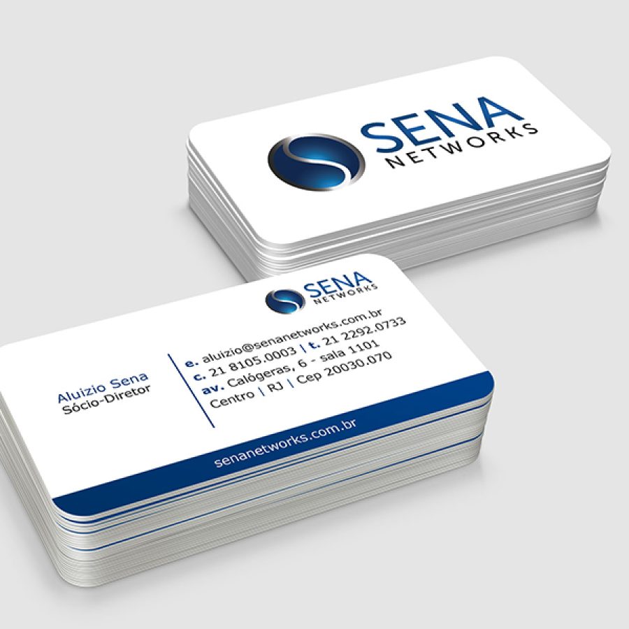
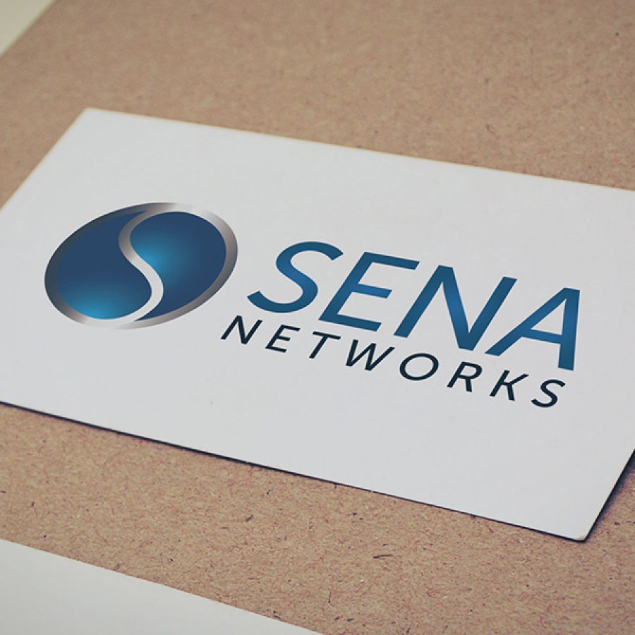
Through the redesign, Sakada helped structure and strengthen all of Sena Networks’ communication, making the logo more modern and elegant, using blue, black and gray to be used solid or in gradient, colors previously chosen by the client to convey the necessary credibility and seriousness. The “S” in the word Sena was adopted as a symbol and works perfectly to represent the brand on social media and various materials.
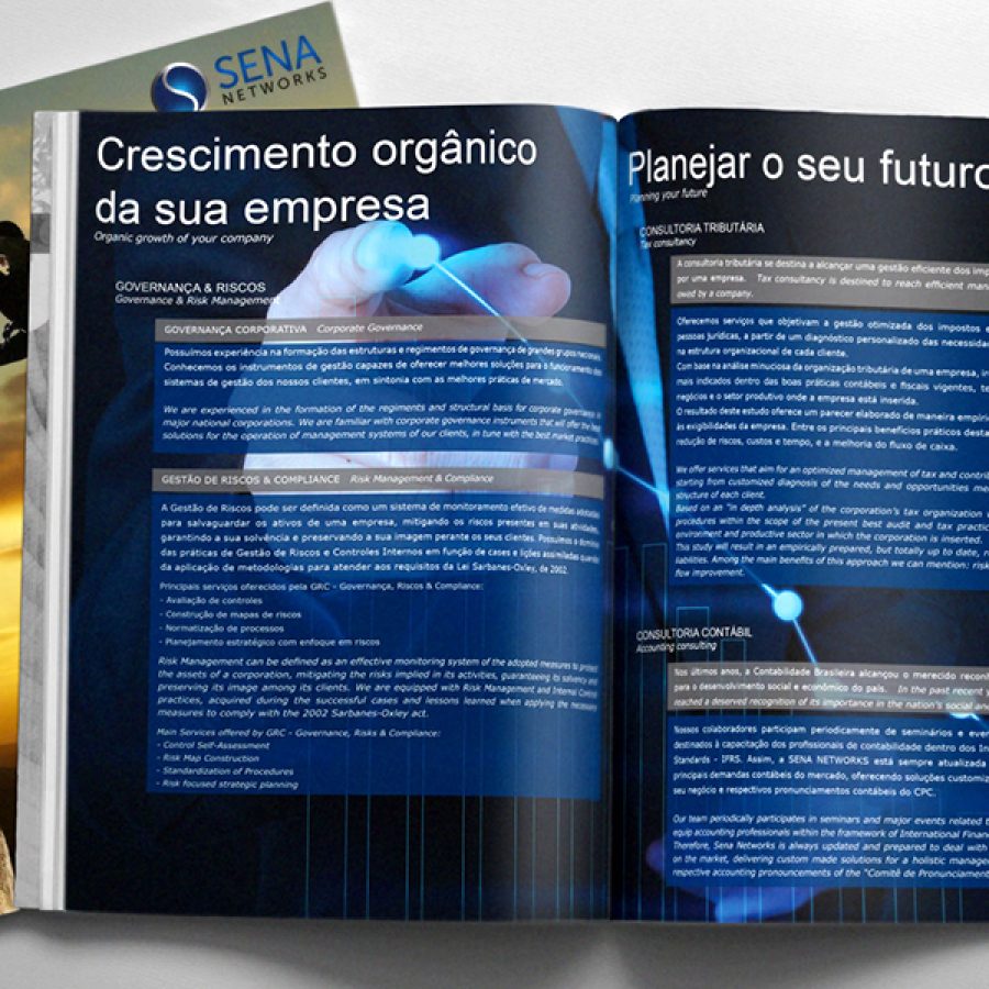
We also created the brand’s complete stationery: folder, banner, sheet, business card and seal for envelopes.

