Successful Rebranding
Challenge and Results
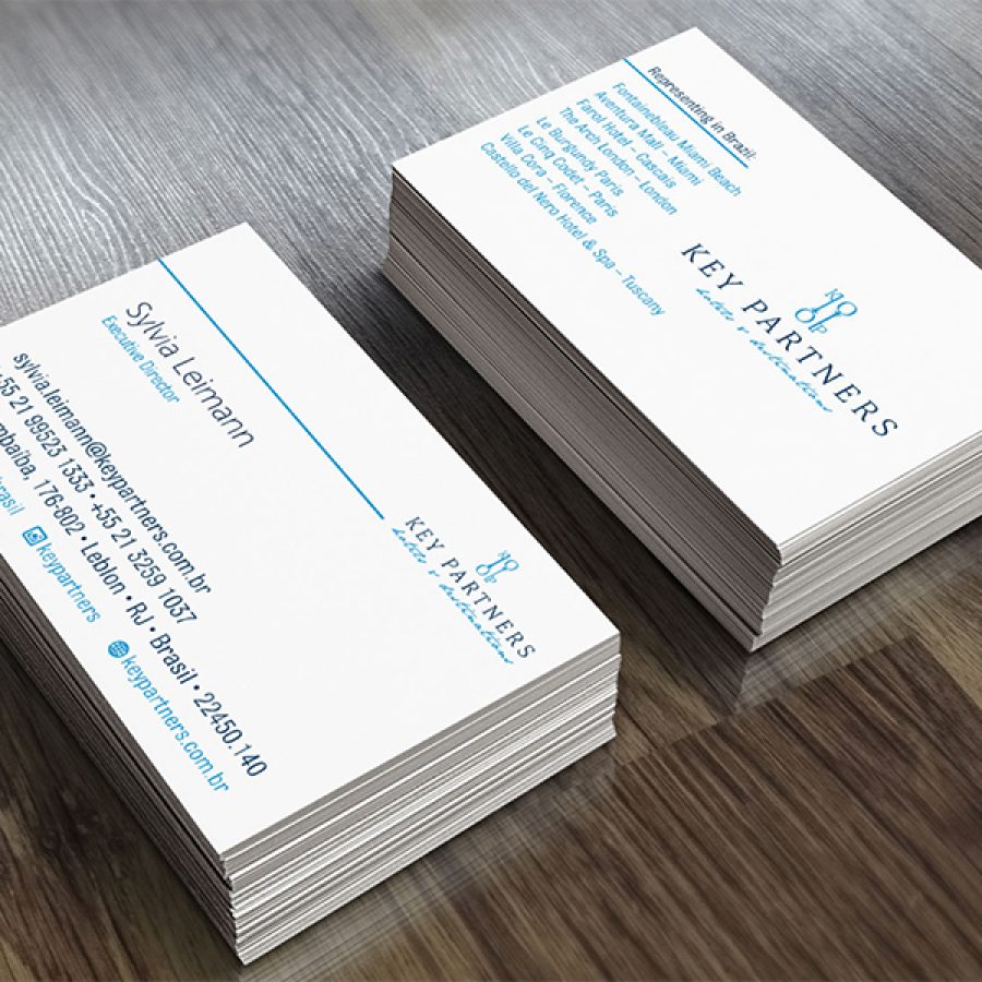
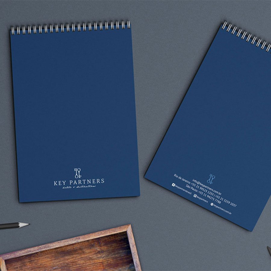
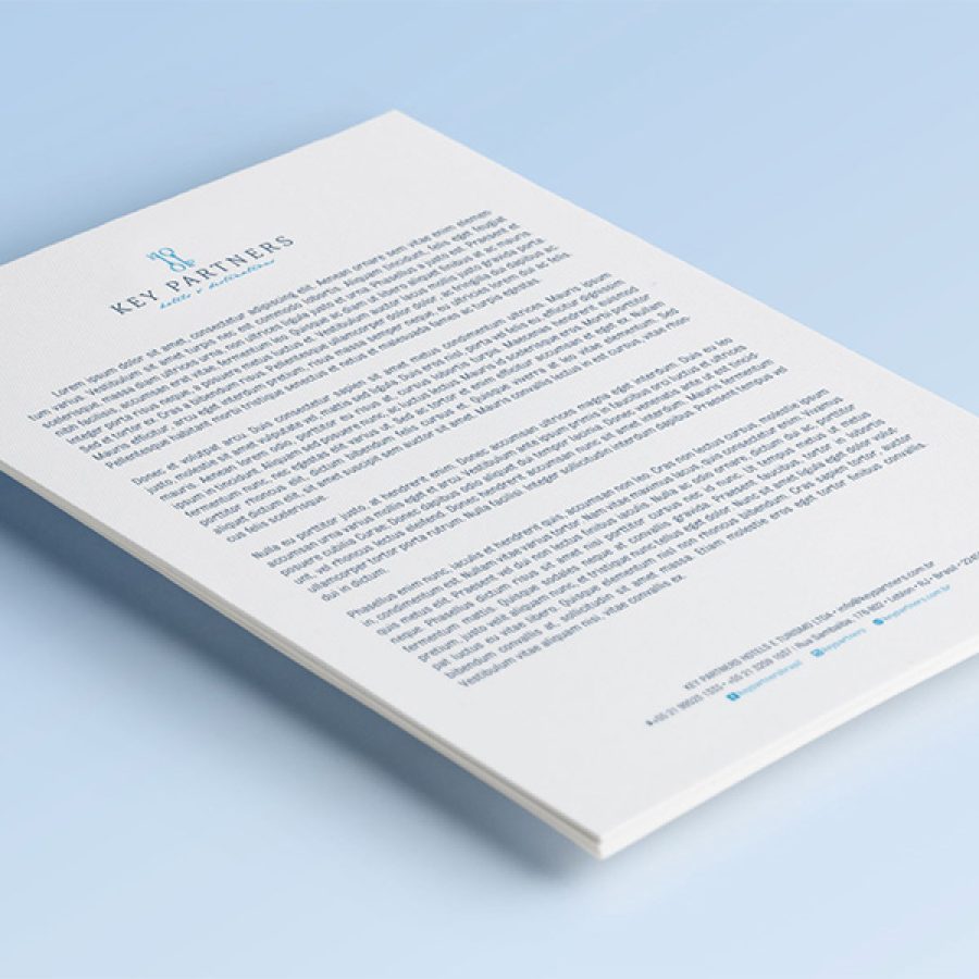
Key Partners offers marketing and consulting programs so that luxury hotels and resorts can create and expand their visibility in Brazil. The company’s director, Sylvia Leimann, sought out Sakada to reformulate the company’s logo and identity.
The initial goal was to bring a classic language to the brand, through typography and colors, navy blue and light blue. When creating or renewing a brand, we are constantly careful to know the universe in which it fits. Key Partners needed an icon. Previously, it worked with the KP monogram, but now it has two keys, an example of the company’s partnership and commitment.


